
I like to people-watch at my local wine store in Manhattan. On a Wednesday evening in the midst of happy hour, two women by the red wine section caught my attention, taking their time to glance at the sea of labels on the shelves, before recognition flashed in one of their eyes. She picked up a bottle she’d clearly seen before—the label comprising an abstract collage of magazine cutout images—relieved that the browsing process reached a conclusion.
On her way to the register, I couldn’t help but ask what led to this final selection. The fellow customer admitted that the first time she came across the label just a few weeks before, she chose it for the aesthetic design. “And now it’s one of my favorites,” she revealed, for its aromatic notes of cherry and lavender.
They say don’t judge a book by its cover, but does the same logic ring true for wine labels? Industry experts would beg to differ. Considering a wine based on its exterior design isn’t a bad idea, especially if it sparks curiosity and pulls you in long enough to learn more about what’s within the bottle.
“If I did not know the wine at all and I was looking at the label, I would want it to tell me something about what kind of experience I should expect,” says Stevie Stacionis, co-founder of the Oakland and Napa-based wine shop Bay Grape, alongside her husband Josiah Baldivino. And, oftentimes, that’s the exact intent of the winemaker.
“I feel like beer kind of led the movement,” says Baldivino. “And a lot of winemakers decided, ‘Let’s just get away from the standard-looking labels and do something fun.’ Before you would see, maybe 10% of the labels would be fun and fresh. Now it’s probably like 60%.”
This shift in thinking has a major contributor: the industry’s evolving demographics. These days, wine professionals are younger than ever before. “You are starting to see a lot more up-and-coming [winemakers],” Baldivino adds. “It’s those types of people that I think are getting a little bit more experimental with not only the grapes but also the labels. I’ve [also] seen labels, when parents are running it, are super classic and old-school looking. As soon as the kid takes over the winery, they switch it up.”
At Bay Grape, Stacionis and Baldivino take pride in being their shoppers’ personal sommeliers. But sometimes, people want to browse without assistance; when this happens, the couple enjoys observing what kind of labels compel their customers most.
“You definitely see them gravitate towards the funner labels,” says Baldivino. “The nondescript ones are usually the ones that you have to hand-sell and talk about. It’s like art—sometimes labels aren’t the most inviting and so people just gloss over and don’t even want to take the time to turn the bottle over.”
With a similar mindset, sommelier, wine consultant and former wine buyer Nicole Erica believes leaning into more artistic label designs is crucial for brands to stand out. “I have nothing against traditional methods, especially if it’s a winery with so much history, but I think [labels] really matter to younger consumers,” says Erica. Turns out, Gen Z holds more than $140 billion in spending power, and is particularly focused on the social impact of the brands they support. In this way, Erica adds, “I don’t think it hurts to update some things and see how more, kind-of-quirky labels might catch new consumers,” especially with a strong brand mission to boot.
At The Prisoner Wine Company, a subset of beverage giant Constellation Brands, labels are thoughtfully considered. “Wine label design is the first point of contact between consumers and a brand, setting the stage for their experience,” says Angela Knotts, brand director for The Prisoner Wine Company. “In a crowded market, it acts as a beacon, helping the brand stand out and attract attention. It invites consumers to engage with the brand on a deeper level, fostering loyalty.”
When it first released in 2000, The Prisoner’s innovative label made the brand an instant trendsetter. “The design of The Prisoner Red Blend label is an etching by Spanish artist Francisco de Goya, which is an evocative artwork from the 1800s that served as a visual protest against social injustices of that time,” says Knotts. “When the inaugural vintage was released, the use of this artwork was disruptive as the design broke away from the traditional and conservative norms prevalent in the wine industry.”
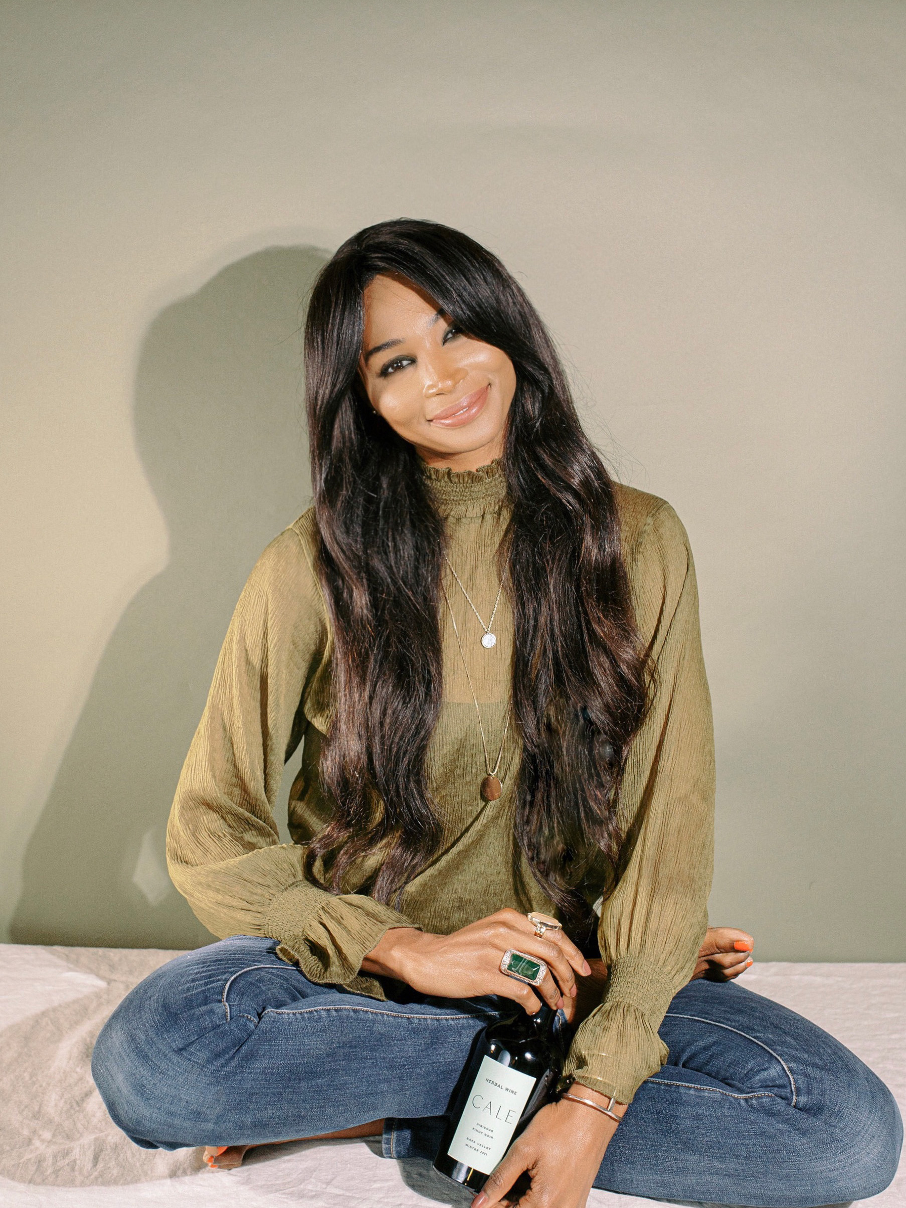
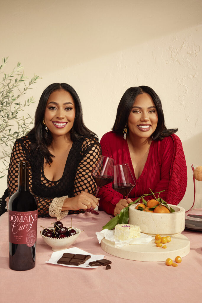
Following this ethos, Domaine Curry, co-founded by Sweet July’s founder Ayesha Curry and her sister-in-law Sydel Curry-Lee, is the latest addition to The Prisoner Wine Company portfolio. Domaine Curry’s label recently underwent a revamp timed to the launch of its 2021 Founders Red Blend, 2021 Cabernet Sauvignon and its newest bottle—the 2023 Sauvignon Blanc.
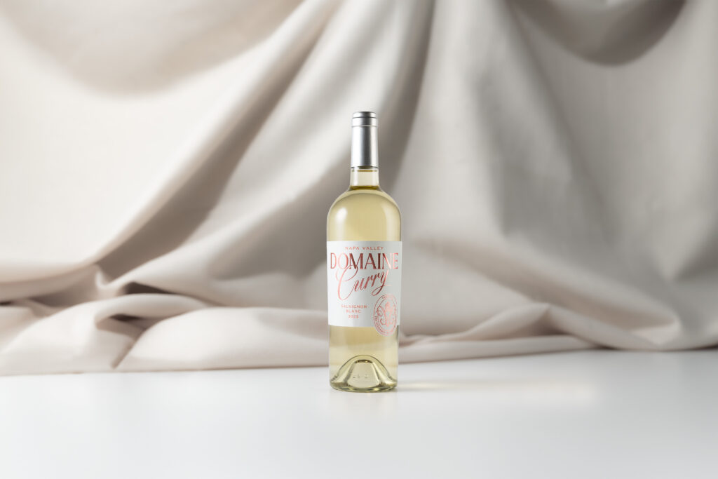
“Sydel and Ayesha were adamant about not opting for a conventional label with black font; instead, they wanted something that stood out and embodied the strength, virtue, loyalty, diversity and independence of women,” says Knotts. “The result is a label that exudes femininity yet commands attention with its intricate details and bold presence.”
Women across the wine industry are unsurprisingly at the forefront of this pivot to symbolic and narrative labels. Sweet July spoke to three of these founders and winemakers—Ayesha, Justine Osilla, and Chenoa Ashton-Lewis—about their captivating wine label designs that both aesthetically please and emotionally reflect what’s inside the bottle.
Ayesha Curry, co-founder of Domaine Curry
How important was label design when it came to revamping Domaine Curry?
Ayesha Curry: So important! We wanted every part of the wines’ new look and taste to reflect not only Sydel and myself, but also the feeling we want consumers to have when they pick up our bottles. The Prisoner Wine Company has a track record of innovative and beautiful designs, so we worked with them and their agency (Co-Partnership) to design something brand new that reflected the more colorful, vibrant future we wanted the wines to have.
What is your favorite detail on this label?
AC: The monogram is my favorite—it has so many little Easter eggs that reflect parts of our brand values: the torch refers to the flame that doesn’t go out from Proverbs 31, the mirrored flourishes on either side are stylized versions of “DC” for Domaine Curry, and there are even two subtle female profiles facing each other. It’s almost a family crest, and we’re excited to see how we can use that symbol moving forward.
Is there any special significance behind the bold maroon color chosen for the revamp?
AC: The deep burgundy we chose is reminiscent of the color of red wine, but it has a subtle matte texture that we think feels rich and tactile. It’s a bit more of a traditional wine color, but it really shines in contrast with the coral foil we chose for the text and monogram. That color is bold, eye-catching, and almost electric. We think the colors complement each other well and really pop on the shelf.
What would you say is your main driving force when creating a compelling label?
AC: We love a unique aesthetic! We hope that the tasting experience tells folks all they need to know about the quality of the wine, but with the package we wanted to create a beautiful object that tells the consumer a bit about our vision for the brand and how personally we consider every aspect of Domaine Curry. We’re so happy that the final product does that storytelling through words, design, color and texture.
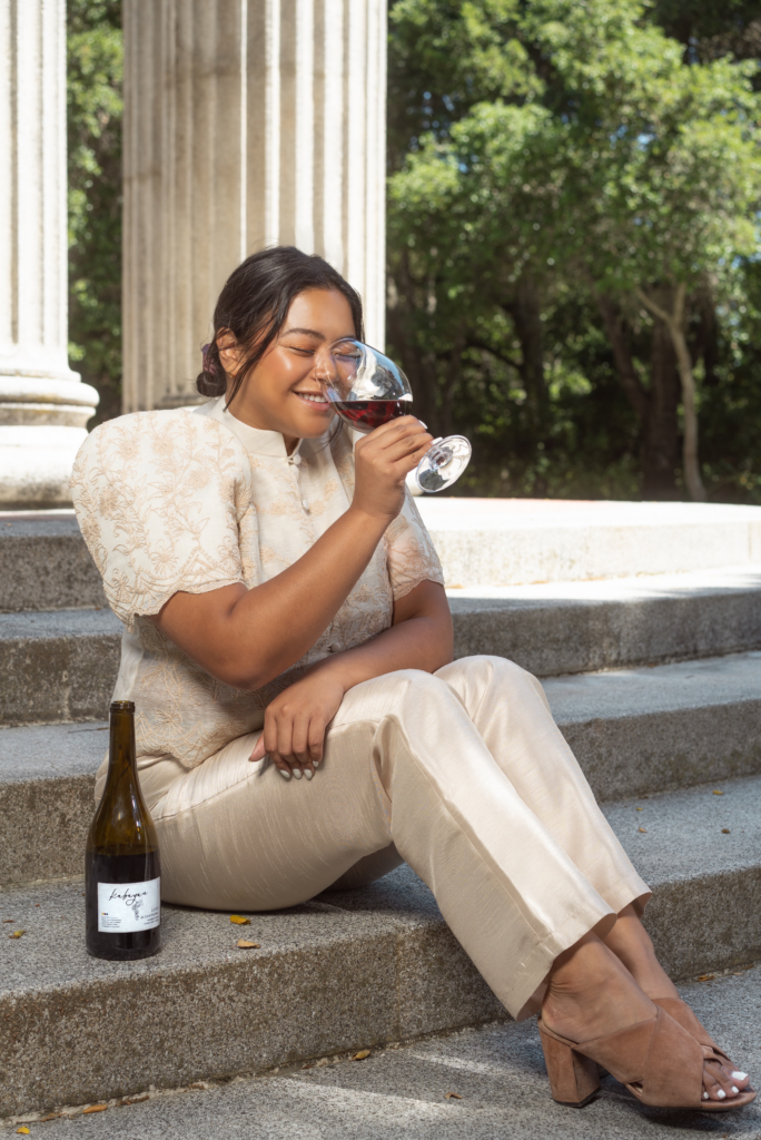
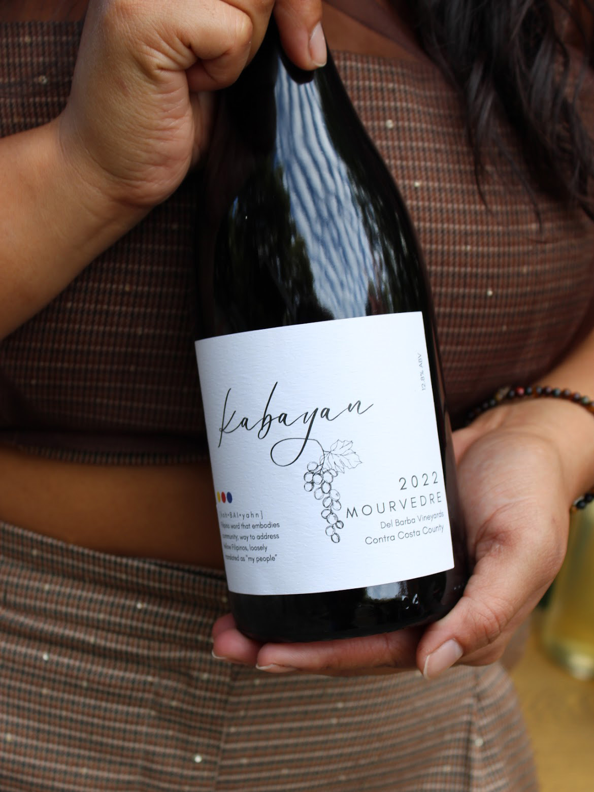
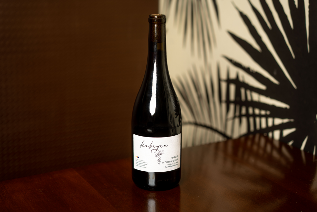
Justine Osilla, founder and winemaker at Kabayan Wines
When it came to creating your label, did you always have a dream design in mind?
Justine Osilla: I had an idea that I wanted it to be timeless and minimalistic. At that time, I was like, “Okay, I really see myself having this white label and I want ‘Kabayan’ slapped right in the middle of it.” I wanted it to feel like a luxury kind of brand. Not feel too young but not feel too old either. Which was perfect, because my style of winemaking is not entirely natural nor is it entirely conventional.
What was your main goal with this very intentional label design?
JO: I’ve been studying winemaking forever and my priority was to make a great product. And with this label, something that I focused on was being able to get my story out there and my mission, which was to create a wine that pairs well with Filipino food. I wanted to make it accessible to my people. For people who are not Filipino, I want them to look at that and be like, “I’ve never seen this before, what does that mean?” And [from there] take a deep dive and learn about this culture.
What was the collaboration process like with the label’s artist (also your friend), Anna Pryor, who designed your first label?
JO: I saw it and I was like, “That’s it, that is it!” I love that she incorporated my culture’s flag colors—red, blue and yellow—and then also put the definition of Kabayan on the label. In that design, [the Kabayan definition] was my favorite thing, because I felt like that was a part of letting people into my culture, which nowadays is so important to me. Even now, I’m still rediscovering my culture—I just came back from the Philippines. Being able to share that with people is really special to me.
You have a label revamp coming up in the spring! What inspired this change?
JO: I love this question. This label was inspired by one of my favorite female winemakers, Tara Gomez—her label used to be Kita Wines and she was known to be the very first female indigenous winemaker. She’s always been such a great mentor and inspiration in my journey. Her old label had this very minimalistic, symbolic linework. I was literally just in my room looking at this wine bottle with her old label and I had a few dried roses in it and I came up with a symbolic linework. So I did a single line art of the national flower of the Philippines called the Sampaguita. That is going to be my new logo and label for my new release.
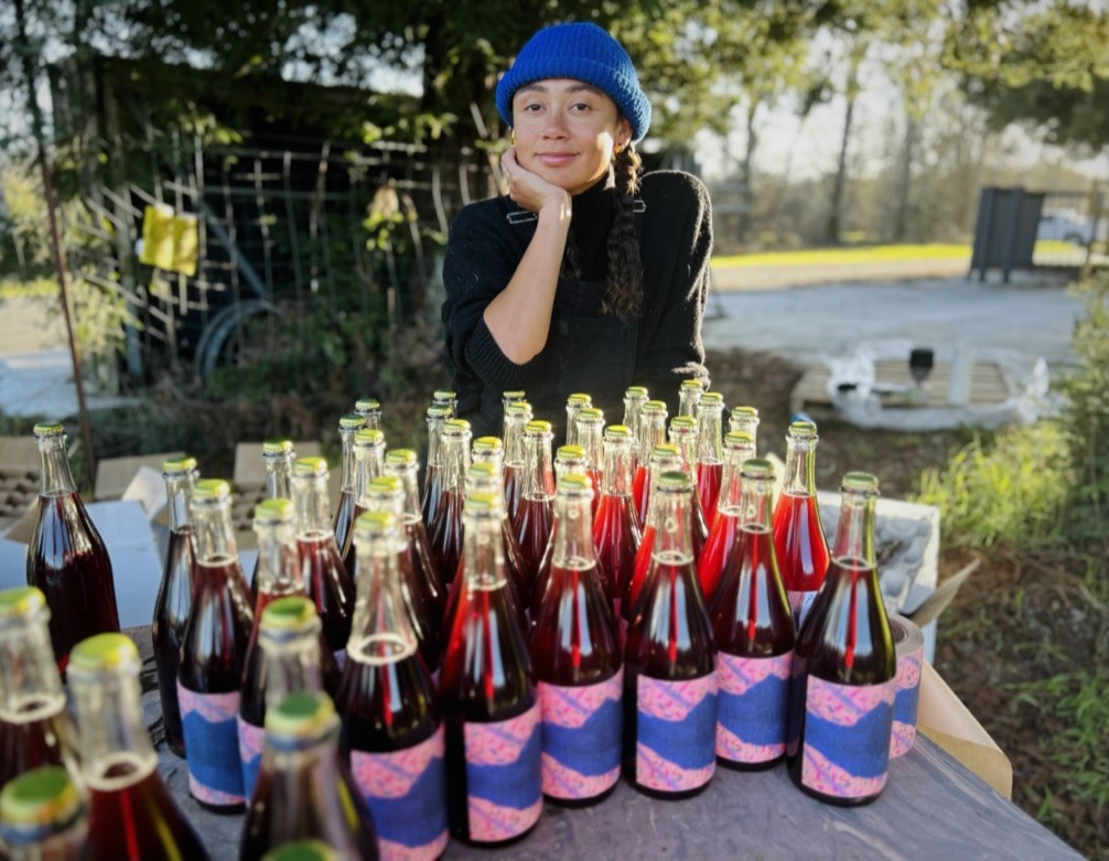
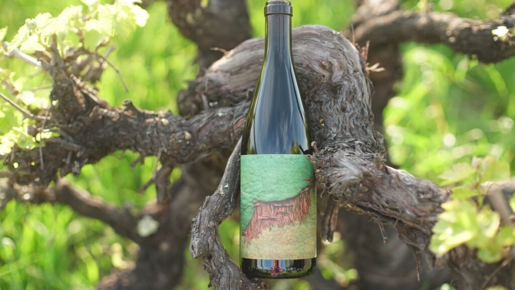
Chenoa Ashton-Lewis, co-founder and winemaker at Ashanta Wines
How important was the label design process for your brand?
Chenoa Ashton-Lewis: It was pretty important to us. This whole project definitely is my partner and I’s love project; it really just comes from our heart and our soul. So having labels that felt very close to us was super important. My partner, Will [Basanta’s], mom [Laura Basanta] is a fiber artist based in southern Illinois. [These labels] are actually photographs of her fiber art. She does some amazing, unique pieces. We take these really high quality photographs—Will does; he’s a photographer. And then I design them and maybe adjust the colors sometimes. Depending on the wine that we have, I’ll adjust certain colors and styles just to either have a contrast or compliment to the color of wine, or color of (the) bottle. We loved how it was something that remains in our close-knit project, being from someone that’s family.
Which one of your labels is your favorite?
CAL: The Zazen Zinfandel is definitely one of my favorites. We first made this wine in 2020 when California was on fire, especially more of the Western coast where we’re making wine in Sonoma and Napa. And we were also sourcing grapes from Sierra Nevada—the only place where we could get blue skies. The following year, in 2021, it was the complete opposite where the hills (in Sierra) were completely on fire. Zazen is my middle name—it’s a Buddhist practice in meditation that means separating your ego from yourself and also practicing non-attachment. The word Zazen I really like to use when it comes to winemaking because you kind of have to release this ego, this expectation and just be adaptable to the current climate changes.
What do you hope for someone to see reflected on your labels overall—their first visual impression of your wine ?
CAL: I hope it creates a curiosity. Getting a sense that these wines have a lot to say. There’s definitely a vibrancy in them but also certainly a seriousness.
Do you think wine labels play a role in sharing a brand’s story?
CAL: Definitely. I mean people can design labels however they want to but it is exciting to see these more modern labels that are defying the standard rules but also still holding a quality in the wine. There are winemakers that are putting wines out there with these more interesting, creative labels and also making incredibly good wines.